Sunday 28 September 2014

THE MIND OF GOD .....

   
I don't always blog my spiritual pages - some of them are simply too personal - but this one isn't in
that category!  It came out of a line in one of our Sunday hymns where the phrase "the mind of God" was used, and I remember thinking that I wouldn't dare to presume to know what God was thinking!

So anyway, that was what was rolling around my brain when I was working on this page.  I just made a painted background as usual, and as usual I stuck to one colour.  I keep telling myself to use two or three but I'm not very good at it.
So then when I put some collage on I made myself use a good strong contrast colour - very often I'll end up choosing pieces which are from the same palette, I get sort of stuck in the tone on tone way of working, and lots of shades of blue looks GOOD doesn't it.  Anyway, I climbed out of my rut on this occasion.  Not quite sure what I was thinking when I made the figure - she reminds me of an African woman with big necklaces, can't remember the name of the tribe who dress that way.  Reflecting on the fact that she looks a bit "other" and "different" connected back to my thoughts about the mind of God, and that it doesn't work in the same ways as ours.
So then of course I had my page subject, although I wasn't quite sure what I wanted to say yet, so focused on doing a bit of doodling, and you know how much I enjoy that!
On this occasion I didn't even feel the need to cover every single inch of the page with doodling, although most of it got treated to some dots - I do like adding them, they seem to work like shading.
And of course I was able to work through my ideas about the mind of God, and to conclude that the problem in thinking was mine and not Hers!  When you try to see the world from God's point of view a lot of things change ....

This is one of my favourites among my recent pages - its partly the colours, but somehow it seems quite "free", something I work towards in my art but don't often achieve!!

Saturday 20 September 2014

FRIDA ... AND THE GELLI PLATE

  
While I was in Virginia back in May I bought myself a gelli printing plate, but have only recently managed to find time to play with it.  This page is the product of one of my early efforts - and I'm pleased to say that I managed to print directly onto a page in my (wire bound) journal, without needing to either extract all the pages or paste one in!  Success.

My first few experiments were on separate sheets, but eventually I had a go in the journal and was thrilled with the results I got on the lovely quality paper - I didn't risk best quality paper on the the first ones!  So anyway, below you can see what I got - I understood why I'd got the white patches (uneven pressure on the plate) but didn't care too much.  In fact what I did was use some yellow paint to sort of "fill in" the gaps.
But what I really LOVE is the pattern it gives on the paper (you do need to use plenty of paint). Don't know how to describe it really, but the close-up picture below gives you a better idea - very organic-looking somehow?
So then I had a gorgeous page in my journal that I couldn't WAIT to work on.  Black seemed like an obvious foil for the pink, orange and yellow and I started with a bit of collage in the top right corner and a picture of my heroine Frida Kahlo in the other.  Then I started doodling a black line around areas that seemed to be shapes in their own right ... and it sort of went from there!
In fact I go SO absorbed in what I was doing that I forgot to take any more pictures until I'd finished it, but at some stage I made the connection between the organic shapes I was working with and Frida and me .... so it kind of became about the little cells and bugs than are the unseen enemy (pain) and how you can find against it.
Because of course, that's why Frida is my heroine, because she did and she made art anyway even when she had to lie in bed and work on an easel which rolled towards where her hand was, because she could hardly move.  Now that's heroism!  Am not heroic but try to be brave in my own small way .... at least on my better days anyway!

Sunday 14 September 2014

DIFFERENT?

 
Another page from my latest journal - my new square (the pages are approx 10 x 10") journal.  Still finding this a joy to work in, especially because of the quality of the paper, but hoping to move on from this eventually into hand-made journals.  I like the idea of a journal which is literally my own work - from sheets of paper to finished, bound result.

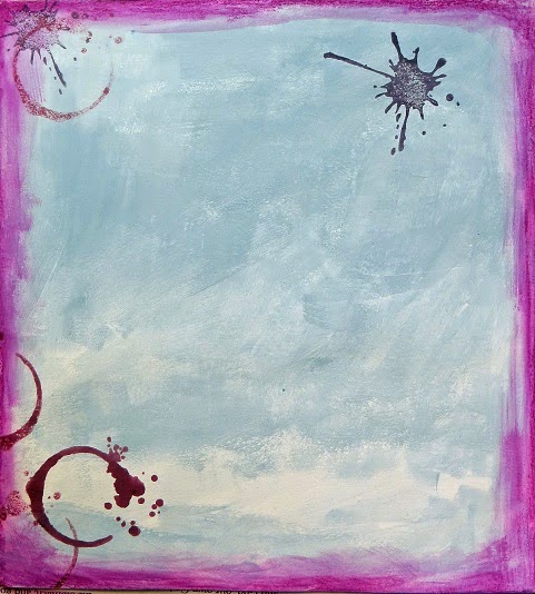
Anyway, I was messing about with backgrounds and trying to incorporate shapes and colours which I could work with and around, not to mention making sure that I used a variety of colours and not just shades of the same one!  This one was produced with my trusty Neocolour II crayons.
I hadn't any idea when I began work what the page would be about, so below you can see my tentative steps into creating a "frame" for the page using pattern and doodling, and a bit of collage. For those who are new to my work, the wormhole doodling is done with a Pitt artist pen which is waterproof and writes well over paint and other substrates.  The doodles involve Posca paint pens, my second favourite art material after the crayons!
There was a hiatus of a few days before I worked on this page again, adding the collage figure, a bird and a section cut from a coloured copy of a much earlier journal page.  I learned that tip from Teesha Moore and its a really valuable one.
It was contemplating the weirdness of the figure I'd produced that led eventually to what I wrote here - I almost never use quotes, but only journal my own words and feelings.

Where I live we have a large population of migrants from the Indian sub-continent and women wearing Islamic dress, up to and including the full burkha are a common sight on our streets.  I struggle to see a fully veiled figure because all my instincts tell me that what I'm seeing is a repressed, subjugated woman, and as a lifelong feminist that really troubles me. I'd found myself giving glowering looks at such figures and realised that I had an attitude problem I needed to address. I'm still working on that.
But what I wanted to express was the way we, the way I was treating people who looked "different" and making judgements about them.  I was guilty of assuming that the women I saw were downtrodden victims; now some of them may indeed be, but by no means all, or even most.  This perception of difference does not give me the right to glower disapprovingly, any more than any other difference of dress, race or whatever.  Just because my intentions were good doesn't make it any less discriminatory.

I do feel passionately that we are all just human beings, often with enormous cultural differences, but we mustn't let these things divide us but try to find ways to bridge the chasms of misunderstanding and ignorance that separate us.  As always journalling about the things which trouble me help me find a way to understanding and acceptance - and I've now embarked upon a mission to smile warmly at every burkha clad woman I meet.  You never know, it might just make a little bit of difference .....

Sunday 7 September 2014

AN EARLY AUTUMN??

 
I made this page just over a week ago, one of those times when I'm recording life around me rather than wrestling with stuff I find difficult.  I do both.  Historically I've always dreaded the approach of Autumn - it comes from decades of living in old, cold houses with not enough money to heat them properly.  Every year I have to remind myself that I now live in a modestly sized house which has cavity wall insulation and double glazing, and that I won't have to huddle in 3 sweaters and fingerless gloves if I want to make art!

Anyway, this was one of those pre-prepared backgrounds I regularly make - in this case blue paint with Neocolour II crayons in fuschia pink around the edge, plus some ink blot/rings stamped in purple and burgundy.  I've got lots of ink pad colours because I like to use them as you might watercolours.
Then when I decided I'd make a page about the early Autumn, this didn't seem quite the right sort of colour palette, I mean shouldn't it be golds and browns?  Then I thought, it can be any colour I like, so why not blue and burgundy?  I had some new leaf stencils I wanted to play with so tried these out with gesso, added a wormhole or two and some bits of collage.  As you can see the white didn't really work too well for the leaves.
So I went back and outlined the leaves with a fine point pen, added a Modigliani lady who looks a bit cold if you think about it, and doodled some dots.  I still wasn't that thrilled with the leaves, but didn't hate them enough to trash the page.
My solution in the end was to introduce some some colour into the leaves, and that seemed to work out OK, although now I wish I'd left them black and white.  Never mind.  Anyway, I do rather like the finished page, particularly the colour scheme.  The burgundy dots were done with my Posca paint pens, as were the light pink doodles on the collage - this is where their opacity really comes into its own.
But best of all, where I am right now we're having a bit of an Indian summer, so long may it continue!  It won't of course, but I don't need to dread winters any more - maybe I'll do a journal page about looking forward to snuggling up by the fire in my favourite blanket and warm PJs, watching feel-good films on the TV as I wait for it to be Christmas ....

PS: Still loving this new square journal!